F-Pattern Thinking: UX for the Way People Read
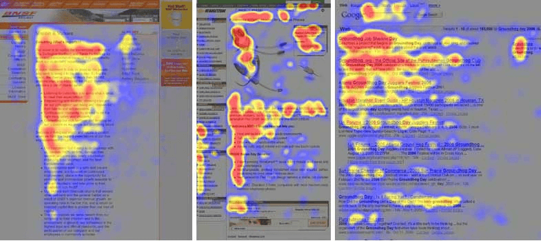
On average, users read only 20–28% of words on a webpage. The rest? They skim.
And they do it in an F-shaped pattern—across the top, a bit further down, then vertically down the left.
👀 Why? Because we’re in a hurry. Jakob Nielsen called it “F for fast.”
We scan headlines, bold words, and the start of lines—just enough to grab value before moving on.
📰 Look at Indian sites like Times of India or The Hindu.
Big headline top-left ➡️ list of stories below ➡️ all left-aligned. Perfect F-pattern design.
💡 How to design for F-pattern users:
Put the most important info at the top & left.
Front-load keywords in headings/paragraphs.
Use short paras, bullets & whitespace.
Bold, clear headlines to grab scanning eyes.
📌 Bottom line: Don’t fight skimming, design for it.
Respect attention, and readers will stick around.
Sources: Nielsen Norman Group, IBRUK India